メインコンテンツまでスキップ

コンポーネントライブラリー

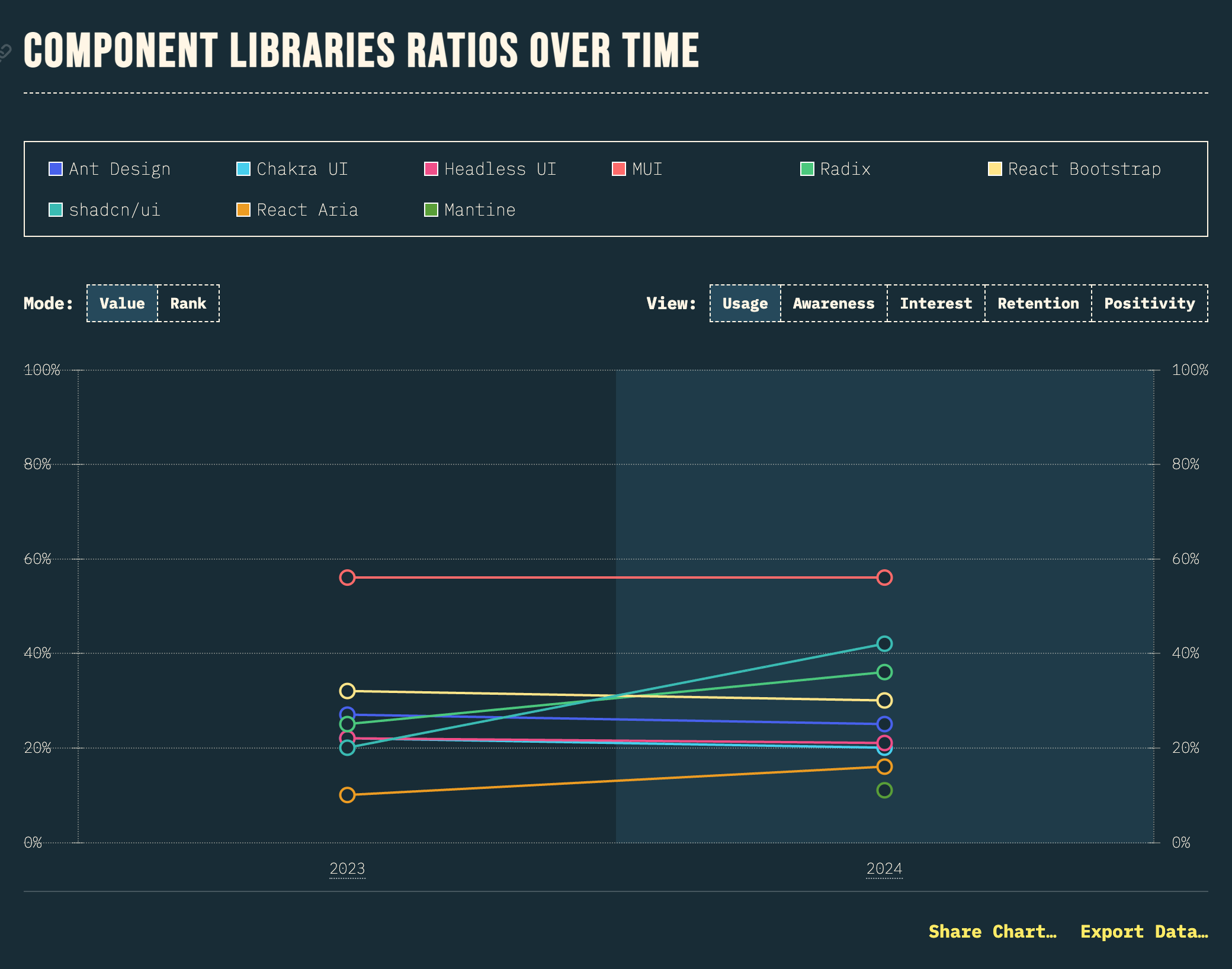
While MUI maintains in top rank in terms of usage, shadcn/ui is making huge gains, doubling from 20% to 42% in a year; as well as topping the positivity chart with 80%!

(訳) MUIは使用率の点では依然としてトップランクを維持していますが、shadcn/uiは、この1年で20%から42%へと倍増し、大きな躍進を遂げています。さらに、好感度チャートでも80%でトップに立っています!

https://2024.stateofreact.com/en-US/libraries/component-libraries/ より引用

スタイル付き UI とヘッドレス UI

コンポーネントとは?で説明したように、React コンポーネントでは見た目と振る舞いを定義することができます。コンポーネントライブラリーには、見た目も振る舞いも提供するタイプ (ここでは便宜的に「スタイル付き UI」と呼ぶことにします) と、振る舞いだけを提供するタイプ (ヘッドレス UI) があります。

  • スタイル付き UI
    • MUIReact BootstrapAnt Designなど
    • メリット: 見た目が定義済みなので少ない記述で UI が実装できる
    • デメリット: 見た目のカスタマイズで複雑化しやすい
  • ヘッドレスUI
    • Headless UIReact Ariaなど
    • メリット: 振る舞いのみ提供されるので見た目を管理しやすい
    • デメリット: 見た目の実装コストがかかる

必ずしも上記の分類に当てはまらないライブラリーもあります。

MUI のサンプル

MUI は、Google の Material Design を実装したスタイル付き UI ライブラリーです。

import {
Button,
Card,
CardContent,
CardActions,
Typography,
TextField,
Stack,
Box,
Alert,
} from '@mui/material';
import { useState } from 'react';

export default function App() {
const [name, setName] = useState('');
const [submitted, setSubmitted] = useState(false);

const handleSubmit = (e: React.FormEvent) => {
  e.preventDefault();
  setSubmitted(true);
};

return (
  <Box sx={{ padding: 3, maxWidth: 600, margin: '0 auto' }}>
    <Typography variant="h4" component="h1" gutterBottom>
      MUI サンプル
    </Typography>

    <Typography variant="body1" color="text.secondary" paragraph>
      Material Design を採用したコンポーネントライブラリー
    </Typography>

    {submitted && (
      <Alert severity="success" sx={{ mb: 2 }}>
        送信が完了しました!
      </Alert>
    )}

    <Card>
      <CardContent>
        <Typography variant="h6" component="h2" gutterBottom>
          ユーザー登録フォーム
        </Typography>

        <form onSubmit={handleSubmit}>
          <Stack spacing={2}>
            <TextField
              label="お名前"
              variant="outlined"
              fullWidth
              value={name}
              onChange={(e) => setName(e.target.value)}
              required
            />

            <TextField
              label="メールアドレス"
              type="email"
              variant="outlined"
              fullWidth
              required
            />

            <TextField
              label="パスワード"
              type="password"
              variant="outlined"
              fullWidth
              required
              helperText="8文字以上で入力してください"
            />
          </Stack>

          <CardActions sx={{ justifyContent: 'flex-end', mt: 2 }}>
            <Button
              type="button"
              variant="outlined"
              onClick={() => {
                setName('');
                setSubmitted(false);
              }}
            >
              クリア
            </Button>
            <Button type="submit" variant="contained">
              送信
            </Button>
          </CardActions>
        </form>
      </CardContent>
    </Card>

    <Card sx={{ mt: 2 }}>
      <CardContent>
        <Typography variant="h6" component="h2" gutterBottom>
          ボタンのバリエーション
        </Typography>

        <Stack direction="row" spacing={1} sx={{ mb: 2 }}>
          <Button variant="text">Text</Button>
          <Button variant="outlined">Outlined</Button>
          <Button variant="contained">Contained</Button>
        </Stack>

        <Stack direction="row" spacing={1}>
          <Button variant="contained" color="primary">
            Primary
          </Button>
          <Button variant="contained" color="secondary">
            Secondary
          </Button>
          <Button variant="contained" color="success">
            Success
          </Button>
          <Button variant="contained" color="error">
            Error
          </Button>
        </Stack>
      </CardContent>
    </Card>
  </Box>
);

}

オープンコード型

shadcn/ui は、次の特徴を備えたコンポーネント集です。

  • オープンコード: コンポーネントのコードが変更可能
  • コンポジション: 全てのコンポーネントに共通で組み合わせ可能 (コンポーザブル) なインターフェースが提供されている
  • 配布: スキーマとコマンドラインツールを使って簡単にコンポーネントの配布できる
  • 美しいデフォルト: すぐに使える見た目
  • AIフレンドリー: LLM (大規模言語モデル) がコンポーネントのコードを参照してコードを生成できる

HTML/CSS 仕様の進化

かつては JavaScript での振る舞いの実装が必要だった UI も、徐々に HTML/CSS だけで実装可能に

details 要素のサンプル

<details> 要素を使うと、JavaScript なしで折りたたみ可能な UI を実装できます。

export default function App() {
return (
  <div style={{ padding: '20px' }}>
<h1>FAQ</h1>

    <details>
      <summary style={{ cursor: 'pointer', fontWeight: 'bold', marginBottom: '8px' }}>
        React とは何ですか?
      </summary>
      <p style={{ paddingLeft: '20px', color: '#555' }}>
        React は、ユーザーインターフェースを構築するための JavaScript ライブラリです。
        宣言的で、コンポーネントベースのアプローチを採用しています。
      </p>
    </details>

    <details style={{ marginTop: '16px' }}>
      <summary style={{ cursor: 'pointer', fontWeight: 'bold', marginBottom: '8px' }}>
        コンポーネントとは何ですか?
      </summary>
      <p style={{ paddingLeft: '20px', color: '#555' }}>
        コンポーネントは、UI の独立した再利用可能な部品です。
        React では、関数コンポーネントやクラスコンポーネントとして定義できます。
      </p>
    </details>

    <details open style={{ marginTop: '16px' }}>
      <summary style={{ cursor: 'pointer', fontWeight: 'bold', marginBottom: '8px' }}>
        useState とは何ですか?
      </summary>
      <p style={{ paddingLeft: '20px', color: '#555' }}>
        useState は React の Hook の一つで、関数コンポーネントで状態を管理するために使用します。
        open 属性を指定すると、最初から開いた状態で表示されます。
      </p>
    </details>
  </div>
);

}

dialog 要素のサンプル

<dialog> 要素を使うと、モーダルダイアログやポップアップを簡単に実装できます。

import { useRef } from 'react';

export default function App() {
const dialogRef = useRef<HTMLDialogElement>(null);

const openDialog = () => {
  dialogRef.current?.showModal();
};

const closeDialog = () => {
  dialogRef.current?.close();
};

return (
  <div style={{ padding: '20px' }}>
    <h1>Dialog サンプル</h1>

    <button
      onClick={openDialog}
      style={{
        padding: '10px 20px',
        backgroundColor: '#007bff',
        color: 'white',
        border: 'none',
        borderRadius: '4px',
        cursor: 'pointer'
      }}
    >
      ダイアログを開く
    </button>

    <dialog
      ref={dialogRef}
      style={{
        padding: '20px',
        borderRadius: '8px',
        border: '1px solid #ccc',
        maxWidth: '400px'
      }}
    >
      <h2 style={{ marginTop: 0 }}>確認</h2>
      <p>この操作を実行してもよろしいですか?</p>

      <div style={{ display: 'flex', gap: '10px', justifyContent: 'flex-end' }}>
        <button
          onClick={closeDialog}
          style={{
            padding: '8px 16px',
            backgroundColor: '#6c757d',
            color: 'white',
            border: 'none',
            borderRadius: '4px',
            cursor: 'pointer'
          }}
        >
          キャンセル
        </button>
        <button
          onClick={closeDialog}
          style={{
            padding: '8px 16px',
            backgroundColor: '#28a745',
            color: 'white',
            border: 'none',
            borderRadius: '4px',
            cursor: 'pointer'
          }}
        >
          OK
        </button>
      </div>
    </dialog>
  </div>
);

}

まとめ

  • 見た目の実装を最低限に: スタイル付き UI がおすすめ
  • 見た目の実装にも注力したい: ヘッドレス UI or HTML/CSS 仕様を活用してコンポーネントライブラリーを導入しないのもアリ
  • shadcn/ui ならどのケースでも使いやすいかも